Hi, welcome to our CSS Basics guide. This will cover how to write CSS
alongside HTML.
CSS is a large topic and this guide will only partially cover what we
plan on teaching. If you have a strong understanding of the language
already, you may feel free to skip sections.
Note: our weekly guides aim to provide a general landscape ... an
overall survey of what’s most essential about the technology at hand
and the basics of how to use it. From a technical or skill
perspective, our guides are not exhaustive or thorough because there
are already many other resources on the internet that are just that.
We encourage you to check them out -- we’ve linked some.
Part 0.
What is CSS?
CSS stands for “Cascading Style Sheets”. It’s used as presentation layer
to a webpage’s HTML markup. A good way to think of CSS is the formatting
rules for the HTML content. This can be used improve content
accessibility and override defaults of HTML. CSS gives you the control
of not only how things look but how things are read on different devices
(mobile, screen reader, etc.).
Before we dive in, watch the video Below of Miriam Suzanne (
for Mozilla Developer's Youtube Channel
) describing some common frustrations when it comes to CSS. An
insightful point Miriam makes is that CSS is awesome with the
caveat that it should be designed to fail. This means that all
the rules we make in CSS are subject to fail based on what device,
browser, or preferences the user has. This is why purely HTML pages
maintain default styling and are inherently responsive:
like the first website ever!
What we should be using CSS for is to make flexible rules that add a
thoughtful presentation layer to redefine defaults in an accessible way.
Here we are, putting fonts and colors on the web. But it’s worth taking
a step back and asking: what does it even mean to design on an unknown
and infinite canvas? This problem isn’t new, it’s not going away, and
there are no simple answers. Design on the web will always be weird –
but CSS is a living document, and we have the power to keep making it
better.
Part 1.
Where to write CSS
There are 3 approaches on where to write CSS relative to your HTML
document:
Internal Stylesheet allows you to write CSS directly in your
.html file by simply placing the CSS <style> tag
within the <head>:
The method you choose will mostly be decided by preference and what point
you are in producing your website. Where
inline styling & internal stylesheets might be useful for
testing ideas quickly in the beginning or making a single-page website,
external styles helps unify multiple pages later down the line
(since to update the style one would only need to update one external .css
file).
I think (using an external stylesheet with) CSS makes more sense if
you're like, "Okay, I'm a big organization making this big app and I
want to style all these parts the same because they're all components."
Whereas if I'm just writing my personal website, I don't need to make 50
things look the same... because I am making each part special.
Part 2.
CSS cascading
Specifically, CSS is called “cascading” because there is a hierarchy or
precedence for how styles are applied:
Styles defined in an external stylesheet have the least power. An
internal stylesheet will override any conflicting declarations in an
external stylesheet. But any inline styling will override any internal
stylesheet. In other words, there is a lot of flexibility and
specificity possible with CSS.
Part 3.
How to write CSS
The syntax for CSS is pretty simple ... The 3 things you'll need to are
selectors, properties and values:
The first step will be to tell the stylesheet which element on your HTML
document you want to select to style. Below, I've written an
<div> tag to demonstrate the many ways to select the
same element in our CSS:
         /* select all divs */
div {
}

/* specify which child we want to select */
div:first-child {
}

div:last-child {
}

div:nth-child(1){
}

/* select the id of 'hello' by using the # symbol */
#hello {
}


/* select the class of 'world' by using the . symbol */
.world {
}
Now that we've written the selctors, you can fill the curly
brackets with a list of properties with specific values:
         div {
  font-size: 20px;
}
The syntax will always be ... property: value; ... Below
you'll see that I listed font-size as a property and
20px as the value. Each property is looking for a
specific of value type.
Let's look at some other examples:
         div {
  background-color: rgba(0,0,0,1);
  background-color: black;
  background-color: "#000000";
}
Below says all <div> tags will have the
background-color be black in 3 different ways. Each one
overides the other, making it “bad CSS,” but I show this to illustrate
that although the syntax is specific for each property, there are many
ways to change them.
Now that we know how and where to write CSS, let's go over some basics
in styling.
note: What follows will be most useful for CSS beginners
Understanding Defaults
    <button> hey world </button>
    <div> hi world </div>
    <h1> hello world </div>
    <sup> sup world </sup>
hi world
hello world
sup world
The browser will automatically stlye default CSS for certain HTML
elements. These styles might change from browser to browser, device to
device and they ultimately act as a fallback for lack of styling. When
defining CSS, consider why it's styled this way before overriding the
default. For example, a button is pressed so it may need to look
press-able and a header is large so it may need some hiearachy.
Styling: Color
Since we were just talking about color, let's go over the basic ways we
can color our page. First, let's take a look at
background-color: to input a solid color into the property
of background-color, you can use
css color names, hex values in quotes, or (red, blue, green, alpha) to achieve this.
Below I simply used the default css color of magenta:
Lets add some text and color that, too: The color is now
rgba(0,255,255) and either hex codes or css color names can
be used for this property, just like background-color.
What about more advanced coloring? Although this looks kind of
complicated, there are tools available to help write more advanced
colors in CSS like linear and radial gradients!
note: not all outdated browsers will run gradients which is why we
have a fallback color before the gradient ...
CSS allows you to put an image as a background on any element you'd like
by adding url path as the value for the background-image. I
found the image "black-hole.jpg" and place it in a folder called
"images" for this example. As you can see, the image repeats itself by
default with the native size of the original image:
The size of a block element is always 100% width with a size dictated by
the content. An inline-block element's height and width are both
dictated by the content. These sizes can be changed with
height and width:
There are many other properties that effect the structure of document (
flow, grid, flex-box,
media-queries, etc. ) which we'll cover in later guides.
Styling: Position
There may be times where you need to break the flow and have more
control over where things are on the page. You can use different
positioning properties to achieve this. Below is an example of element
that is fixed to the top:0px; left: 0px;, which are the
placement properties of an element that is
position: fixed or position: absolute ... Try
scrolling here:
         nav {
  position: fixed;
  top: 0px;
  left: 0px;
}
If you need to control the position but don't need to stick while
scrolling, you can use position: absolute and specify the
position relative to the top bottom left right
         nav {
  position:absolute;
  bottom: 0px;
  right: 0px;
}
Styling: Typography
There's quite a few things you can do with typography on the web. Before
we get into that, let's talk about the padding in the example of default
<p> tag that I've given a padding with 2 values. When inputting a
margin or paddings value, you can enter up to four values indicating the
amount for the top, right, bottom, left sides (in that order). If you
enter 1 value, it applies it to all four sides. If you enter 2 values,
it applies the first to the top and bottom and the second to the left
and right. If you enter 4, it will specify each individually. So in this
example, the text is being padded from the top/bottom by
10px and left/right by 20px.
Here is some text that I would like you to read. This is the end of
the text. Thank you for reading this text.
         p {
  padding: 10px 20px;
}
Besides the lesson in spacing, let's take a look at this text as is. We
haven't defined anything, yet there's some style inherit to the
<p> tag. The font itself is being displayed as the system font's
primary serif font, for many would be "Times New Roman". Although this
text isn't offensive to me, let's try to specify a
font-family:
Here is some text that I would like you to read. This is the end of
the text. Thank you for reading this text.
         p {
  padding: 10px 20px;
  font-family: helvetica, arial, sans-serif;
}
Default web fonts are common fonts on every system under a few
categories:
sans-serif, serif, cursive, monospace, fantasy ...
Referring to a font like helvetica will work if the user
has that font installed on their machine. Specifying a series of
fall-backs is useful in the case that a user doesn't have the font. In
this example, the browser will fallback to arial then the
system default for sans-serif.
You can also add web fonts to your site by creating a
@font-face. Below you can see we added a new font along
with 2 other properties that changes the size and alignment of the text.
Now, let's go back to the original text we were working with and let's
add all the controls you can have with typography on the web: specifying
weight and style as well as the spacing between letters and between
lines. You can even transform the all the character's case with
text-transform :
Here is some text that I would like you to read. This is the end of
the text. Thank you for reading this text.
This section will cover some of many visual effects you can do with CSS.
Let's start with what you can do with borders. The
border property has 3 potential values: the size of the
border, type of border and color of the border:
I first learned HTML and CSS on CodeAcademy in 2012 or 2013. One of the
projects was a weird dumb website that was supposed to be a personal
page. I threw everything I’d learned about HTML / CSS on that. I really
liked border-radius at that point, so everything had a border-radius and
funny colors.
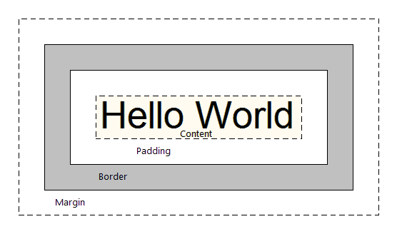
CSS Box Model
The “CSS Box Model” is about how every element you’ll style in CSS is
basically a box, and you can manipulate that box through its various
layers.
Each element is represented as a rectangular box. The box has layers.
Inside the box is the box's content, padding, border, and margin built
one on top of the other. This is important to understand before we get
to layout in CSS, as everything is built on top of this “box model”.
Content
if it’s a block element, you can control this with
height and width properties
Padding
“buffer” area surrounding your content
same background color as content, if any
example: padding: 10px;
Border
often a different color (and style, like dashed)
example: border: 5px dashed red;
Margin
“buffer” area to give breathing room between other content
always transparent
example: margin: 20px 10px;
Animation
There are some interesting possibilities with animation within CSS. The
@keyframe method allows you to define keyframes similar to
any animation program. You can add as many animation stops as you need
at any interval you please. Below I've structure a simple animation with
4 keyframes and named it structure ...
You can then apply this structure as an animation value to
any element you'd like. There are quite a few ways to edit the animation
within the element such as: duration, iteration count, etc ...
Hovering is an important interaction that you'll experience a lot on the
web and this is done through the :hover selector ... below
you'll see a styled circle that the
background-color:white is changed on
circle:hover to background-color:black ...
You may notice that it's a smooth transition and that's because of
transition: 2s ease ... this defines how smoothy and
quickly a CSS value is interpolated over time ...
There's a lot of things you can do with CSS and we haven't even
scratched the surface ( We'll be diving a bit deeper into reponsiveness
and other advanced aspects of CSS in the next guide ). The best way to
start using CSS is to experiment with as many methods as you can so you
can see how they behave. CSS is what overides the defaultness of the web
and it's what gives the web a vibrant state of difference.
The relationship between CSS and HTML is so exciting. HTML is exciting
in that it's semantic... there's so much structure already built into it
that you can lean on. But then to also use CSS to make that structure
your own is important and exciting.
Create a Fruitful ID card using some of the things we learned with CSS.
Use it as an excuse to experiment with new things, to override defaults
and exercise style.
requirements:
the card should be width: 250px; height: 400px;
include the name of the workshop: "fruitful.school"
include your name
include the date / term ("fall 2020")
include a random ID card number
include an image: of yourself or whatever
include anything else you'd like and try something new!