Hi, welcome to our CSS Layout & Responsive Layout guide.
If you are following our guides so far, by now you might be coming across a handful of fundamental issues regarding layout. Basic HTML and CSS is great if you want a simple site that presents one thing after the other, but how do you create something with more of a layout or landscape? And how does that layout change depending on what device you're on (big screen? laptop? tablet? mobile?) Anyway, if you are having a lot of issues with CSS now, don't worry… this guide digs into more details about the weirdness and intricacies of CSS.
Note that learning CSS layout and positioning is not intuitive and requires study, practice, and trial and error. So be patient, open up your web inspector, and have fun!
Note: our weekly guides aim to provide a general landscape ... an
overall survey of what’s most essential about the technology at hand and the basics of how to use it. From a technical or skill
perspective, our guides are not exhaustive or thorough because there
are already many other resources on the internet that are just that.
We encourage you to check them out -- we’ve linked some.
Part 0. Material
Every material has a grain.
Take wood for example. Wood grain generally means which orientation the wood fibers go. One of the most fundamental sayings of woodworking is to cut wood “with the grain” which helps improve the strength of whatever you’re creating.
In other words, it’s good to first understand your material so you can work with it, not against it. You can best collaborate with your material if you understand its inherent tendencies.
The idea that the web has a unique grain comes from Frank Chimero, in his piece The Web’s Grain from 2015.
I believe every material has a grain, including the web. But this assumption flies in the face of our expectations for technology. Too often, the internet is cast as a wide-open, infinitely malleable material.
So what is the grain of the web?
Part 1. Fluidity
The web was first created as a way to share documents with anyone. Like we mentioned, many of the first people using the web to share documents were academics, or professors. You’ll see many of their sites are mostly text-based, with an image or two here and there.
Because the web was designed to present content in the form of documents, we believe the web’s grain is most easily visible the way text moves when you make the browser window a different size.
Try opening these three webpages and resizing them by making them wide and narrow, and seeing how the content is affected:
Text is inherently responsive. It goes with the flow. That's why so many old websites that are mostly text are surprisingly responsive by default.
But learning from the above examples, besides text, we can format other media so it goes with the flow, too. And maybe in general we should design how we read … left to right, top to bottom...
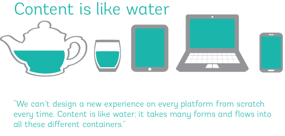
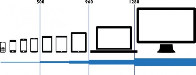
More broadly, responsive web design is a specific approach that focuses on websites rendering well on a variety of different devices — from mobile to tablet to desktop. A variety of techniques are employed to do this, including media queries which we touch on later in this guide.
Generally speaking, it’s not good good practice to design a rigid system with specific breakpoints for every device. Instead, exercise flow and come to terms with the difference of screens sizes and preferences are radically different form person to person, era to era.
Responsive design is a fascinating field, and experiments like responsive logos show that it happens at even with the smallest details. Being able to present the essence of a thing even at a small scale could be seen as a type literacy.
Part 2. Layout
Brief history of layout in CSS
Today in 2020, there are many ways you can lay items across your pages using CSS.
But layout hasn't always been easy. In the old days (90s and early 2000s), using <table> was one of the best strategies at the time to do layout. But a lot has changed since then, and we would recommend not using <table> unless you're displaying tabular data, like a spreadsheet.
Thankfully today, there are new CSS layout methods — like Flexbox (since 2013) and CSS Grid (since 2017), that make things much easier.
But it’s important to understand the other properties and methods as a basis since you’ll likely use a combination of techniques to attain your desired result...
Inline versus block elements
Just a little review from last guide...
By default, each element (or “box”) in HTML is either an inline or block element.
Inline elements “go with the flow.” If you put a lot of inline elements together, you’ll notice them flow left to right like text.
Some classic inline elements:
img … image
a … link
span … generic inline element
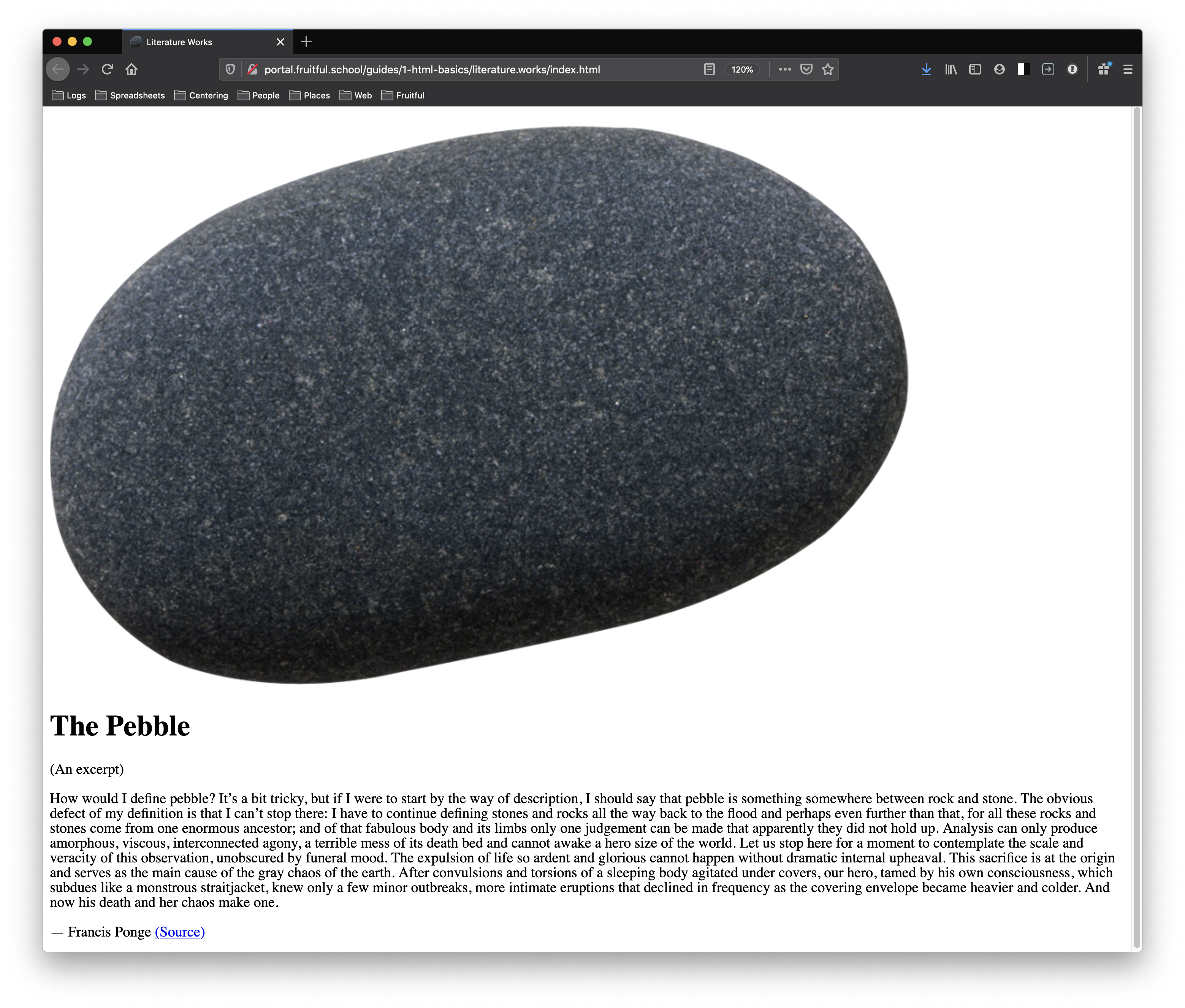
In this example, we started with a bunch of <span>, a classic inline element. We colored them all different colors so we can see them!
How would I define pebble?It’s a bit tricky,but if I were to start by the way of description,I should say that pebble is something somewhere between rock and stone.The obvious defect of my definition is that I can’t stop there:I have to continue defining stones and rocksall the way back to the floodand perhaps even further than that
View in new tab (try opening this and resizing it to watch the lines move!)
<span class="one">How would I define pebble?</span>
<span class="two">It’s a bit tricky,</span>
<span class="three">but if I were to start by the way of description,</span>
<span class="four">I should say that pebble is something somewhere between rock and stone.</span>
<span class="five">The obvious defect of my definition is that I can’t stop there:</span>
<span class="six">I have to continue defining stones and rocks all the way back to the flood</span>
<span class="seven">and perhaps even further than that</span>
Block elements "stack one on top of another” … like blocks. If you put a lot of blocks together, you’ll make a very tall page.
Some classic block elements:
h1, h2, h3, h4, h5, h6 … all the headings
p … paragraph
div … generic block element
In this example, we added one line of CSS that makes the <span> not display: inline but display: block instead. (If you want to change an element from block to inline or vice-versa, you can just override the default style with CSS.)
Now that the <span> are blocks, notice how they now go one on top of each other ... like stacked blocks.
How would I define pebble?It’s a bit tricky,but if I were to start by the way of description,I should say that pebble is something somewhere between rock and stone.The obvious defect of my definition is that I can’t stop there:I have to continue defining stones and rocksall the way back to the floodand perhaps even further than that
/* add this one line of CSS */
span { display: block; }
Some other important differences between inline and block:
Inline elements content area depends on their content. So, they are only as tall or wide as the content inside of them. Therefore, inline elements won’t accept height or width properties. Also, you shouldn’t put a block element inside an inline element.
In terms of formatting, inline elements do not force a new line. Block elements, on the other hand, cause a line break to occur. If you want a line break amongst inline elements, you should use a <br> (line break).
Here is a good site for seeing what the default display value (inline or block) of every HTML element is: htmlreference.io
***
But there is also the possibility for elements to become inline-block. When you set something to display: inline-block, you essentially have the best of both worlds of block and inline. Things go in a flow (like inline), but they can take height and width properties (like block). Note that no elements are inline-block by default.
In the example, we changed the CSS so now <span> is now display: inline-block. Great! Now we have some blocks that go with the flow... indeed, the best of both worlds...
How would I define pebble?It’s a bit tricky,but if I were to start by the way of description,I should say that pebble is something somewhere between rock and stone.The obvious defect of my definition is that I can’t stop there:I have to continue defining stones and rocksall the way back to the floodand perhaps even further than that
/* added a few new lines here */
span {
  display: inline-block;
  height: 140px;
  width: 140px;
  vertical-align: top;
  margin-bottom: 5px;
 }
When you position things with inline-block, you might also want to use the property vertical-align as well. With vertical-align you can align them in different ways, as we did here with vertical-align: top.
***
This philosophy could continue onto a whole site's design. If we design the way we read, which is left to right, top to bottom, then maybe we put the header or title in the first block... and the footer in the last.
“The Pebble” (excerpt)
by Francis Ponge
How would I define pebble?It’s a bit tricky,but if I were to start by the way of description,I should say that pebble is something somewhere between rock and stone.The obvious defect of my definition is that I can’t stop there:I have to continue defining stones and rocks all the way back to the floodand perhaps even further than that
This way, when the page is viewed on mobile or small screens, it automatically works without having to do anything fancy. We are simply embracing the web's grain.
“The Pebble” (excerpt)
by Francis Ponge
How would I define pebble?It’s a bit tricky,but if I were to start by the way of description,I should say that pebble is something somewhere between rock and stone.The obvious defect of my definition is that I can’t stop there:I have to continue defining stones and rocks all the way back to the floodand perhaps even further than that
<header>
  <h1>“The Pebble” (excerpt)</h1>
  <p>by Francis Ponge</p>
</header>
<span class="one">How would I define pebble?</span>
<span class="two">It’s a bit tricky,</span>
<span class="three">but if I were to start by the way of description,</span>
<span class="four">I should say that pebble is something somewhere between rock and stone.</span>
<span class="five">The obvious defect of my definition is that I can’t stop there:</span>
<span class="six">I have to continue defining stones and rocks all the way back to the flood</span>
<span class="seven">and perhaps even further than that</span>
<footer>
    <a href="https://francispongeonlineanthology.wordpress.com/2017/08/10/pebble-a-fragment-of-a-text-of-francis-ponge-translated-by-vadim-bystritski/">Source</a>
</footer>
The two properties display and position can do a lot of heavy lifting when it comes to CSS layout. Let's check them out...
“Display” property
We just looked at the common display values above.
But for the record, every element on a webpage is a rectangular box. (Remember the bookmarklet Boxify?) The display property determines exactly how that rectangular box behaves.
display: block — default (depending on element)
display: inline — default (depending on element)
display: inline-block
display: none — this makes the element visibly disappear, although it still appears in the source code
***
Want to center something horizontally on your page?
The method you use actually depends on the display value of your element.
To center a block element, you need to specify the element's height and width and also give it a margin left and right of auto.
<!-- a div is a block element -->
<div class="quote">
    from <i>Domestic Pensées</i><br><br>
    “A garden is not an object but a process”<br><br>
    Ian Hamilton Finlay (2004)
</div>
body {
    background: black;
}

.quote {
    width: 275px;
    margin: 2em auto;
    /*
       the above line is shorthand for
       top and bottom margins = 2em
       left and right margins = auto
       more on margin property here:
       https://developer.mozilla.org/en-US/docs/Web/CSS/margin
    */
    padding: 1.5em;
    background: yellowgreen;
    border: 4px double black;
    border-radius: 25px;
}
To center an inline or inline-block element, the parent element (element the inline thing is inside of) should have text-align: center declaration.
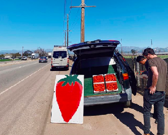
<figure class="image-container">
    <!-- an img is an inline element -->
    <img src="images/strawberry.png" alt="A large painted sign of a strawberry advertising strawberries on the roadside">
</figure>
To center something vertically, that's a bit trickier. You'll find that in the Flexbox section below.
“Position” property
The position property can help you manipulate the location of an element.
position: static — default
position: relative
position: absolute
position: fixed
When you use either position: absolute or position: fixed, know that you’re removing that element from the normal “flow” of the web page. It’s good to keep in mind, especially as you start to think about websites that can easily adapt to smaller or larger screens (“responsive design”).
When you use either position: absolute or position: fixed,
you’ll need to then include specific declarations that specify where your element should be.
For example, here is a "sticker" that goes on top of our previous page. You will see in addition to having position: absolute, it also has top: 8px and right: 8px. These declarations tell it exactly where to go relative to the browser window.
How would I define pebble?It’s a bit tricky,but if I were to start by the way of description,I should say that pebble is something somewhere between rock and stone.The obvious defect of my definition is that I can’t stop there:I have to continue defining stones and rocksall the way back to the floodand perhaps even further than that
Another important property that goes along with absolute and fixed positioning is z-index. Here we made the z-index: -1. z-index accepts integer values and lets you layer things below or on top of each other.
How would I define pebble?It’s a bit tricky,but if I were to start by the way of description,I should say that pebble is something somewhere between rock and stone.The obvious defect of my definition is that I can’t stop there:I have to continue defining stones and rocksall the way back to the floodand perhaps even further than that
The relative position is good when you want something to be positioned absolutely in reference to its parent container...
How would I define pebble?It’s a bit tricky,but if I were to start by the way of description,I should say that pebble is something somewhere between rock and stone.The obvious defect of my definition is that I can’t stop there:I have to continue defining stones and rocksall the way back to the floodand perhaps even further than that
Finally, this is an example where instead of absolute we used fixed, so the sticker stays in one place while the background moves when you scroll.
***
Here is an example of a layout using position: absolute and percentage values. Note that you can make this layout many ways, and this is just one of many ways to make it.
Fruitful Orchard
Welcome to our fruitful orchard! Please select a fruit on the brown menu to get started.
In CSS, there are many different units you can use. When thinking responsively, it's good to remember there are certain units that might be better to use than others.
Pixels px are the most straightforward and inflexible
Percentages % are flexible and dependent on their parent container
Ems em are dependent on whatever font-size the parent container is. This is a relative unit. So 2em equals 2 * whatever the font-size of the parent is.
Rems rem are dependent on whatever the font-size of the body are. So this unit is more global than em, since if I want to change the overall scale, I simply change the body font-size!
vh and vw stand for viewport height and viewport width, which are relative not to the parent container (like percentages) but the browser window (the viewport), so 100vh means "100 percent of the viewport height"
Here is an interesting example website where the font-size is using vw. Try resizing this and see how the font automatically scales depending on your browser width.
There are other units, but these are the most common!
Calc()
calc() is a native CSS way to do simple math right in CSS as a replacement for any number value. Being able to do math in code is nice and a welcome addition to a language that is fairly number heavy.
It has four simple math operators:
add +
subtract -
multiply *
divide /
And this math can be combined with any number of units. For example:
The idea of “floats” comes from print layouts, where text wraps around an image on either left or right. On the web in CSS, the property float specifies that an element should be placed along the left or right side of its container, allowing text and inline elements to wrap around it. The element is removed from the normal flow of the web page, though still allowing other elements to wrap around it.
In the last few years, websites and social media platforms have
introduced explore pages/tabs into their interfaces. Usually these are
just feeds masquerading as explore pages. Other times they are simply
static curated “staff picks” lists, or personalized recommendation
pages. To me, these pages don’t live up to the name “explore”. A feed is
based around time, usually sorted reverse chronologically, whereas an
explore page reveals the expansiveness of a website by pulling from
disparate sources, indifferent to time, allowing one to jump into the
depths of something entirely new. Even personalized recommendation pages
like Instagram’s explore tab aren’t really explore pages either because
they are limited to a user’s interests/similarities to other users on
the platform. Being fed similar content based on your likes isn’t the
same as exploring the vastness of a platform. Explore pages are unique
in that they unearth things that are not necessarily the most popular or
the most recent. Interestingly, when explore pages are built this way it
allows users to approach a platform with an open mind and with less
expectations. Explore pages should make you feel a sense of excitement
similar to the feeling of exploring a new place.
When I worked at The Creative Independent,
we talked about creating an explore page, but we never got far enough
along on the idea to define what the page would actually look like. One
thing we did implement was a
random button
that served up a random interview from over 600 articles across the
site. I ended up moving this button into the main navigation so that
readers could continue to click the button until they found an interview
that interested them. It’s fairly easy to implement a “randomized
items/articles” section on a website. In the case of The Creative
Independent, this simple addition revealed how expansive the site really
was.
<video width="320" controls class="left">
  <source src="stream1.mp4" type="video/mp4" />
</video>

<p>
  In the last few years, websites and social media platforms have
  introduced explore pages/tabs into their interfaces. Usually these are
  just feeds masquerading as explore pages...
</p>

<video width="320" controls class="right">
  <source src="stream2.mp4" type="video/mp4" />
</video>

<p>
  When I worked at <a href="https://indp.co">The Creative Independent</a>,
  we talked about creating an explore page, but we never got far enough
  along on the idea to define what the page would actually look like...
</p>
Note that sometimes you will need to clear your floats. You can see this in action in this example (where we try to recreate the previous layout but using float):
Fruitful Orchard
Welcome to our fruitful orchard! Please select a fruit on the brown menu to get started.
body {
  margin: 0;
}

header {
  background: yellow;
}

aside {
  float: right;
  width: 30%;
  overflow-y: scroll;
  background: sienna;
}

main {
  float: left;
  width: 70%;
  background: lime;
}

/* float is cleared for the footer */
/* as an experiment, try not having this clear and see what happens */
footer {
  clear: both;
  background: cyan;
}
Flexbox
(Since 2013)
Flexbox "aims at providing a more efficient way to lay out, align and distribute space among items in a container, even when their size is unknown and/or dynamic." Since it's still a newer technology, note that some older browsers don't support it. For more details, check out caniuse: flexbox.
body {

  /* vertical centering ... works on any child element */
  display: flex;
  align-items: center;
  justify-content: center;

  /* horizontal centering ... makes all text centered */
  text-align: center;

  /* delete the default margin on body */
  margin: 0;

  /* colors */
  background: black;
  color: white;

  /* responsive font size, 5% of viewport width */
  font-size: 5vw;

  /* by default body is as tall as its contents,
  and since we don't have much (just a sentence),
  we need to fill up body 100% viewport height */
  height: 100vh;

}
<body>
  <div class="sentence">Welcome to my world!</div>
</body>
There are multiple methods to vertically center an element in CSS, but we like using Flexbox for how simple it is. More info
<div> would definitely have to be my favorite element. I think it's so special. <div> is a little home for anyone and everything. And I love the CSS style of flexbox, and I love putting flex on divs. It’s my fav.
Here is an example of how to make the previous layout using flexbox.
Fruitful Orchard
Welcome to our fruitful orchard! Please select a fruit on the brown menu to get started.
The only thing to note is Flexbox isn't great for complex layouts like this, so we had to add one "container" element to make the middle two elements (lime and brown boxes) be side-by-side rather than on top of each other.
<header>Fruitful Orchard</header>
  <!-- this is the start of our new container -->
  <div class="body-container">
    <main>
      Welcome to our fruitful orchard! Please select a fruit in the brown menu to get started.
    </main>
    <aside>
      Fruits
      <ul>
        <li>🍇 Grapes</li>
        <li>🍈 Melon</li>
        <li>🍉 Watermelon</li>
        <li>🍊 Tangerine</li>
        <li>🍋 Lemon</li>
        <li>🍌 Banana</li>
        <li>🍍 Pineapple</li>
        <li>🍎 Apple (red)</li>
        <li>🍏 Apple (green)</li>
        <li>🍐 Pear</li>
        <li>🍑 Peach</li>
        <li>🍒 Cherries</li>
        <li>🍓 Strawberry</li>
        <li>🥝 Kiwi</li>
        <li>🥥 Coconut</li>
        <li>🥭 Mango</li>
      </ul>
    </aside>
  <!-- this is the end of our new container -->
  </div>
  <footer>“𝒯𝒽ℯ 𝒻𝓇𝓊𝒾𝓉 𝓇𝒾𝓅ℯ𝓃𝓈 𝓈𝓁ℴ𝓌𝓁𝓎, 𝒷𝓊𝓉 𝒻𝒶𝓁𝓁𝓈 𝓆𝓊𝒾𝒸𝓀𝓁𝓎”</footer>
However, one cool thing about flexbox (and CSS Grid, as you'll soon see) is that they were designed with responsiveness in mind. They are easily and powerfully paired with media queries.
The below code might not make sense yet, but essentially this media query says "When the browser is 768px or less wide, put the things that were side-by-side before as their own columns, and reverse their order, too!" Try resizing the example to a small width to see this in action.
@media screen and (max-width: 768px) {

  aside,
  main {
    width: 100%;
  }

  .body-container {
    flex-direction: column-reverse;
  }

}
CSS Grid
(Since 2017)
CSS Grid Layout is "a CSS layout method designed for the two-dimensional layout of items on a webpage or application." It allows for "complex responsive web design layouts more easily and consistently across browsers." Like Flexbox, it's still a newer technology, so some older browsers don't support it ... caniuse: grid.
Whenever a mobile device views the page, this line of code in the <head> makes sure the device doesn’t automatically resize the page but lets it appear the size it automatically is. (If you don't have this line, you might notice that your website is automatically scaling down when you view it on a mobile device.)
***
img { max-width: 100%; }
This line of CSS is very useful. It says that all images should be 100% of their parent's width unless they are smaller than their parent, and in that case, they wouldn't expand to fill their parent but just be the size they naturally are.
It's smart to use max-width, especially when dealing with blocks of text. In this previous example, the element article (containing all the text) has this CSS. Try resizing the page and seeing how the text automatically flows when the browser width gets smaller. If you used width instead of max-width, this wouldn't happen.
Part 3. Media Queries
Screen
Media queries are a type of CSS that allow content to adapt to various conditions. They are a fundamental technology of responsive web design. There is a lot of flexibility built into media queries — you can target specific screen widths, specific devices, or specific outputs (like print).
Here is an experimental example. Open this and try resizing your browser window to see what happens. Here is the CSS:
body {
  background: red;
  transition: background 300ms ease-in;
}

@media screen and (max-width: 768px) {
  body {
    background: yellow;
  }
}

@media screen and (max-width: 600px) {
  body {
    background: lime;
  }
}

@media screen and (max-width: 480px) {
  body {
    background: cyan;
  }
}

@media screen and (max-width: 320px) {
  body {
    background: magenta;
  }
}
Here is a more common example in which a menu changes for mobile use. Again, open this and try resizing your browser window to see what happens. Here is the HTML and CSS:
nav {
  text-align: center;
  border-bottom: 1px solid black;
}

ul {
  margin: 0;
  padding: 0;
  list-style-type: none;
}

li {
  display: inline-block;
  list-style-type: none;
  margin: 0;
  padding: 1em 0.5em 1.5em;
}

a {
  color: black;
  text-decoration: none;
}

a:hover {
  background: yellow;
}

@media screen and (max-width: 420px) {
  ul {
    margin: 1em 0;
  }

  li {
    display: block;
    padding: 0.5em;
  }
}
The media query at the bottom says “only apply these styles within this media query if your browser's viewport width is equal to or narrower than 420px.” So looking at those media queries inside, we see that, for example, the li is now display: block; instead of display: inline-block; as it was before. When it applies or the condition is true, the CSS within the media query overrides the other CSS.
Print
Here is another website example. This time, instead of resizing the browser window, try printing the website and saving as a PDF. See if you notice any changes between the website and the PDF.
The above are overrides for when the website is printed. They are here so that the "next" arrow button doesn't appear on the printout or the side column doesn't appear, for instance.
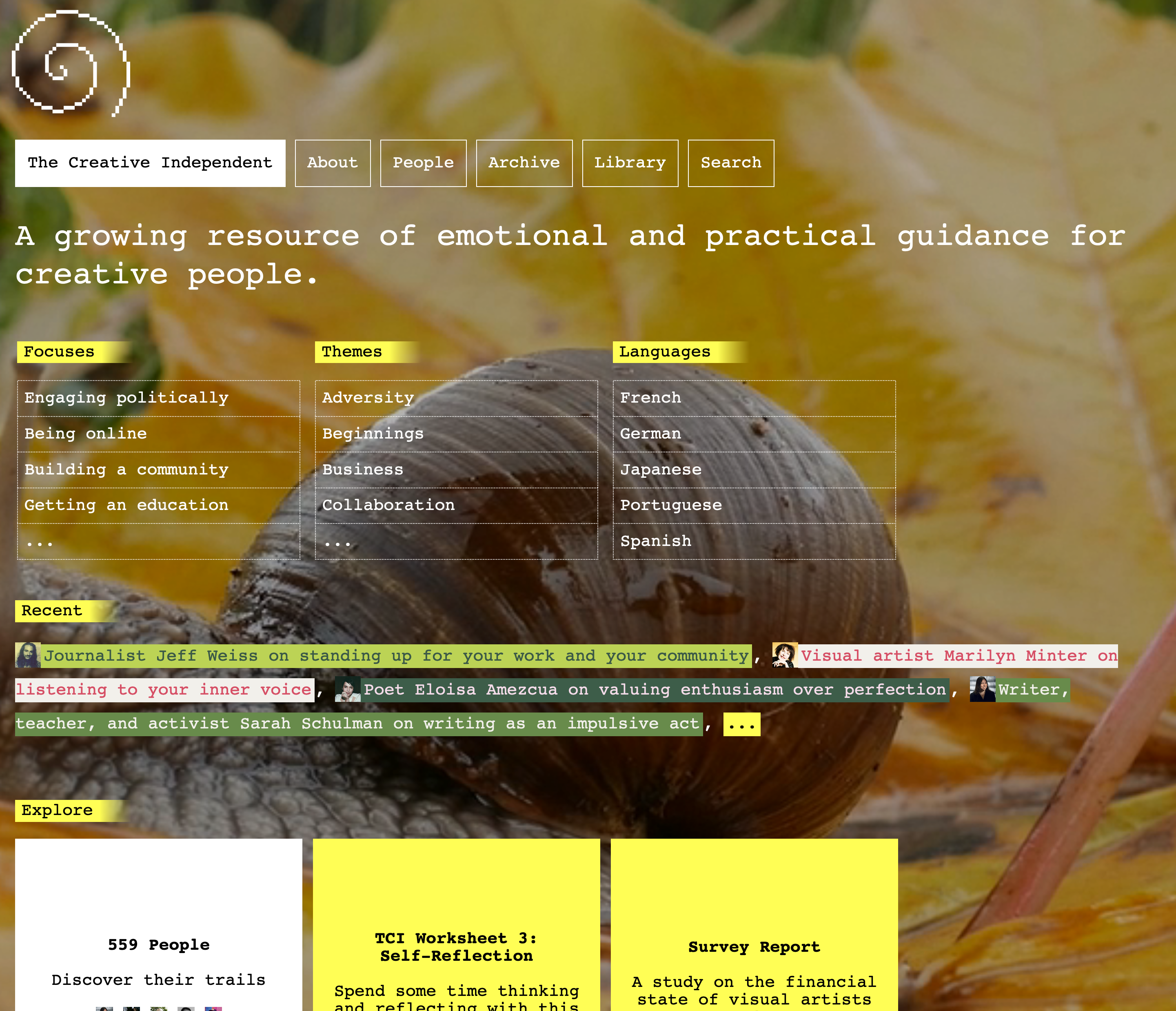
When Laurel was first designing The Creative Independent's homepage, she decided on a strategy of using many elements that were display: inline or display: inline-block because the website was made to grow. She didn't know how many menu items there might be, so she wanted to create a flexible system.
***
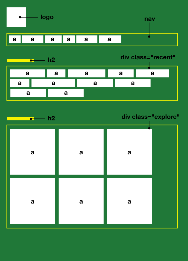
So to start something like TCI's homepage, let's start with a sketch. You'll see there are boxes inside of boxes, or elements inside of elements. Classic nesting tendency of HTML... it's good to think this way.
After making the sketch (and thinking which things are inside of which things), you can go to code. Here is a simplified TCI homepage following the sketch. Feel free to check out the source code, and remember to try resizing the page! :)
🔗 Further CSS layout resources
(Some repeated from above)
Create a profile page for yourself on the "Fruitful Orchard," a hypothetical social media where all you do is show 10 pics from your camera roll. This is a good excuse to try some new things with CSS layout ... including responsive design (sizing down to mobile) if you're up for it, using media queries!
